| Jurassic Park came out almost 20 years ago. |

Here's the compilation of mashups. As you can see, they incorporate not just parts of the Big 4 teams, but also MLS and CFL teams. Some use dated logos, but I was very impressed by most of them nonetheless, including:

Boston/New England - Yep, those are my teams. The red, white and blue were an obvious choice, but it also has the wily leprechaun, and Bruins emblem in the background (signifying hockey's relative importance compared to the other teams). I'd buy a T-shirt with this logo on it for sure.

Los Angeles/Anaheim - I can't believe it, but I think every team in L.A. and Anaheim is included here. I'm shocked that so many teams were included without the logo looking completely trashy. If I wasn't such a homer, this might be #1.

New York - I laud any attempt at trying to combine the numerous logos for this city. This one includes all of them as far as I can tell. LOL @ the Jets awkwardly trying to fit in. Other attempts have produced some great logos as well, including this beaut.

Seattle - Utterly magnificent. This one's got a great color scheme and logo features that fit nicely together. I don't even care about these teams, yet I'm drawn to this combobulation.

Nashville - The Predators part of the logo really sells this one for me. Easily the most bad-ass mash-up of the group. Incredibly, if you combine the Memphis market for a Tennessee state logo, it looks even cooler. (Modern update here.)

Chicago - You've got to look closely to see the cool subtleties on this one. Obviously the White Sock on the Bull's horn shows that this logo knows how to have a crazy night on the town, but then check out how the Bears logo replaces the nose ring. I couldn't find the one in the compilation image above, unfortunately, which looks even better with the Chicago Fire seal in the background.

Philadelphia - Great colors for the city where the Declaration was written, and I can clearly see aspects of all of the Big 4 teams. The snake is part of the logo for MLS's Philadelphia Union, and it probably relates to this Ben Franklin cartoon about how the colonies had to stick together - "Join, or die." Love it.

Milwaukee/Green Bay - The logo gives prominence to the Packers as the state's primary team, but offers aspects of the Bucks and Brewers with the antlers and wheat respectively. It all ties together well visually.

Dallas - It doesn't necessarily excite me, but it's one of the most seamless creations in terms of having one seal that represents all of the city's teams.
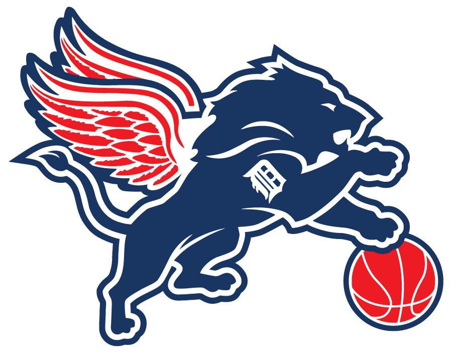
Detroit - In terms of color scheme, the logos don't fit that well, but you've got to like a flying, basketball-playing lion with a Detroit Tigers tattoo on its considerable bicep.

Denver - Really good job representing all of the Big 4 teams in a non-cacophonous manner. The Rockies, Avalanche, and Nuggets all work together based on orography, so using the Broncos' color scheme tied the rest together.

Houston - It's all there, and it all works. The simplicity of it is rather remarkable.

Washington - You get a fairly consistent brand here with some national imagery, plus it doesn't hurt that half the teams here are owned by Ted Leonsis. I'm wondering where DC United is, though. Here's another take with more modern logos, and one with the DC United logo.

Cincinnati - Perfectly sums up how laughable this city's team names are. What screams 'Bengal' about the city of Cincinnati, anyways? Random team names = hilarious logo mashup.

Minnesota - Another one that will make you ROFL-copter to the clouds. Evidently the Twins aspect of this logo is based on an older version depicting actual cartoon Twins (literal much?), and ascends to awesomeness with the Viking and Timberwolf faces joining together in handshake-clad logo win.

Montreal - Pretty solid execution here with a CFL team crashing through the Canadiens logo. Alas, if only the Expos were still around. Oh wait! The Alouette is carrying the Expo logo for a touchdown!

New Jersey - For such an awful state, I find myself really liking this logo. Simple and exactly what it should look like.

Kansas City - Simple but effective. I don't believe the Wizards are incorporated here, though.

Atlanta - This is a good one, except for the Thrashers becoming the Winnipeg Jets. Great flow for a city without a very strong culture and a transient population.

Baltimore - Looks pretty weak to me. I'd instead go with this simple head amputation to keep a consistent bird theme, plus O's fans are naturally inclined to hide their faces.

St. Louis - This is one of the tougher mashups. Two of the teams are blue, while the other by necessity must be red. For that reason I'm not too critical, but when I look at the Cardinal wearing a Rams helmet, I imagine it's looking back at me in indignant embarrassment that it has to wear it.

Miami - This one doesn't do it for me, mostly because the Marlin has got too much going on for a creature with flippers. If someone updates this with the new Marlins logo and incorporates more Heat-wielding Dolphin, then I'll be interested.

Buffalo - It's simple, it works, but in the end it's still Buffalo.

Edmonton - Same deal as Buffalo: it works, but it's Edmonton, only this time half of the logo is comprised of a CFL team.

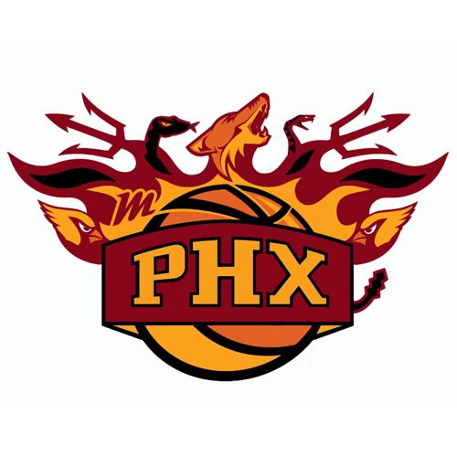
Phoenix - I'm not a huge fan of this logo with the Coyote vomiting a Cardinal at the speed of the Sun, so I would opt instead for this one below, which includes elements of the ASU Sun Devils. (Another alternative here.)
 |
| Burn alive in Coyote howling, Diamondback hissing, Cardinal pecking hellfire! |

Northern California - This one is just a mess. The color scheme doesn't do it for me, and the area has a weird variety of team names, probably because some teams moved there from other cities. Despite being one of the most beloved cities in the country, it seems that San Fran (and the surrounding area) doesn't have a particularly unified brand. The Giants logo on the Oakland A's elephant is just wrong. I don't see the San Jose Earthquakes or the 49ers here (unless they just used the color scheme). It took me a while to realize the swashbucklin' swords were for the Raiders.

Tampa Bay - I'm sure team owners were struggling mightily trying to think of the names they could use for their teams in this city. Tampa Bay isn't known for anything as far as I know. Evidently what you get is a gay pirate with a lightning dagger in his mouth. Was it always winking creepily like that?

Cleveland - Yikes. What a town.
Jacksonville - Oh, I'll let this one go. It was a toughie.
One fave from the compilation image at the beginning was the Pittsburgh mashup, but I could not find a larger version. You just can't beat a penguin pirate made of American steel. That's a city that definitely has a consistent color scheme and personality, so I'm not surprised that one looked so great.
Lastly, here's the original topic with a lot of the original logo designers in case you just can't get enough!
No comments:
Post a Comment