As the MLB off-season rolls along, teams are trying to help their fans forget the excruciatingly long, mind-numbing 162 game season. A season for most teams that was an inevitable failure and ended long before September. A season stimulating harsh, existential struggles about the meaning of it all, and why on Earth you dared to care. A season that-
ooooh! Shiny new uniforms!!
 |
| Prepare for jerseys on steroids! |
Click below for a preview of the trends and styles that will have uniform fetishists flocking to the ballpark next year.
New York Mets
Check out these threads from the NL's favorite whipping boys. Out of the rotation this year is the color black from both the home and away jerseys - a racist move, but fashion is nothing if not offensive. Both looks are quite classic, and just in time for the
anniversary of the team's 50th year in the league.
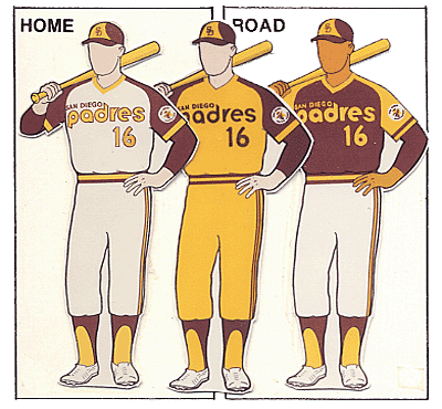
San Diego Padres
I can't be the only one who misses the old Padres uniforms
with orange, or these beauts from the
70's and
80's (what
can't brown do for you?). This lineup definitely won't go down in history as particularly memorable, plus they have three different styles of lettering - what a non-hot mess. What I do like is the camo, although the last thing this low attendance team needs is even less visibility.
Baltimore Orioles
Ornithological correctness be damned: the cartoon bird is back as the logo of the Baltimore Orioles... and I'm lovin' every minute of it. Check out how he's slyly eye-ballin' you from the side. You know he's up to some shenanigans, and after all, that's what the O's are all about.
The only drawback to this logo is that the bird's hat is actually the old one, with an upside-down apostrophe. It would have been mind-blowing if he was wearing a hat with his face as the logo, who in turn had a hat with his face as the logo, etc., bringing logo design win to infinity.
The jerseys aren't bad either, as orange returns as a home uniform for Saturday night games. Evidently I love orange in my jerseys.
Toronto Blue Jays
Also trying to capture past glory are the Toronto Blue Jays. The new logo is a re-tooled version of the old 90's logo, which brings back some powerful memories of Joe Carter, Roberto Alomar, and
Tom Henke's accountant glasses. Note how refined the new logo is, with a sharper beak, crisper lines, and simple colors that make the red maple leaf stand out in awkward Canadian pride.
I haven't seen any jersey images floating around yet, but
new lettering will also be in play as super GM Alex Anthopoulos continues to build a young and improving team.
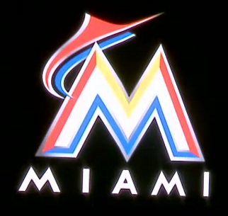
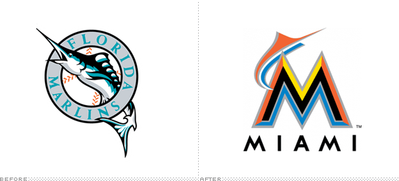
Miami Marlins
No team has made more waves this off-season than the upstart Miami Marlins. They're changing their stadium, name, and now their logo and unis are getting an overhaul, too.
Wow, I didn't see this coming. The bright contrast of colors against the black backdrop is... quite jarring. It's a definite
departure from their old logo. In terms of what it's going for: I guess the blue represents waves, and the yellow is like the sun that you're not supposed to look at (it really does burn my retinas), and the red is, I dunno, Marlin meat?
I am intrigued by how the logo and
jerseys will be embraced by the Latino community, as that is the most important thing for a baseball team in Miami. I also have to give them props for actually taking risks with the design. Even if
75% of fans hate the jerseys now, in 20 years these unis will inevitably be the hottest retro buys on the market. Part of me is starting to like them already...


No comments:
Post a Comment