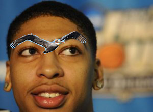
In an ironically unironic move, New Orleans's NBA team has settled on a new name for the future: the New Orleans Pelicans. Possessing all the intimidation of a bunny and none of the mythology of a stork, this new mascot will quickly become a fan non-favorite for years to come.
The fun doesn't stop there, though. With the new name comes a new logo! And there was a contest held by a Canadian design website to create the crest for this new team name which has torn up the internet world among only the smallest niche of logo-philes. Click below to see some of the efforts, as well as the winner.
Logo - "I Know What You Named Your Team Last Winter"
Something about that hat makes me think this logo is coming for Jennifer Love Hewitt. Aside from that, I like how it's a mostly circular seal, including a b-ball, horn, and stern Samuel Arrow face on the bird.
Logo - "I Eat Basketball For Breakfast"
Either this bird has an abnormal growth it needs to have looked at, or it's got a b-ball in its gullet, which is technically a traveling violation. Either way: fix it.
Logo - "Don't Hate the Hat, Hate the Game"
"I came here to do two things: play at divey jazz clubs, and shoot hoops, and I can't find my trombone..."
Logo - "Stick With What You Know: Genetic Abominations"
Dr. Moreau tried to win a second logo contest after his hornet-human mash-up was chosen previously. The results were altogether too frightening this time around.
Logo - "The Legend of Zelda: A Link to the Eyebrows"
I can feel the Triforce in this logo, which has sort of a governmental/stately look to it. On a serious note, I kind of like the little pelicans at the bottom, almost indicating a sort of parental role for the team, caring for the community. Although, I think about the Saints as having more of that role.
Logo - "I'm Not Sure You Know What That Word Means"
Whenever the Pelicans play, the jesters are in court.
Finally, the contest's winning logo...
I don't really have anything snarky to say about this one. Nice colors, with a flash of gold and the fleur-de-lis. The bird itself looks stern and ready to peck at the eyeballs of the competition. It makes this new team name look halfway respectable!


No comments:
Post a Comment