Showing posts with label logos. Show all posts

Wednesday, June 4, 2014

NFL Taking a Roman Holiday

I haven't been posting much, but every once in a while an important news story comes along and hits me in the face with a herring, and I've got to do my duty and report it to the people. So, what am I talking about?

The NFL is abandoning Roman numerals for Super Bowl 50.

Instead of using the concise symbol "L" for 50, the NFL thinks it's drawn up a W with it's new logo using Arabic numerals. Did they make the right decision? You be the judge.


I gotta tip my cap to the NFL's brand and creative team, which has been developing this logo since April 2013 according to the article. Given the winning logo here, that's got to be the cushiest job in world history.

Friday, February 7, 2014

Corporate NFL Logos

Uh-oh, someone's gone and done it again - new NFL logos, this time incorporating actual business logos. http://logoremix.tumblr.com/

Some of these are quite smooth and subtle. My favorite is the Raiders.


Tuesday, February 4, 2014

Star Wars NFL Logos

Don't worry, someone made logos for all the NFL teams that are Star Wars-ized. Take a look.

At the risk of blatant homerism, New England is my fave:


Thursday, January 24, 2013

New Orleans Pelicans Logo Battle Royale

In an ironically unironic move, New Orleans's NBA team has settled on a new name for the future: the New Orleans Pelicans. Possessing all the intimidation of a bunny and none of the mythology of a stork, this new mascot will quickly become a fan non-favorite for years to come.


The fun doesn't stop there, though. With the new name comes a new logo! And there was a contest held by a Canadian design website to create the crest for this new team name which has torn up the internet world among only the smallest niche of logo-philes. Click below to see some of the efforts, as well as the winner.

Tuesday, January 31, 2012

Logos Gone Loco

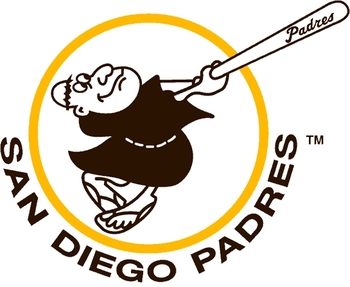
Team logos are a part of sports that I've always enjoyed. As a kid, I liked their aesthetic appeal and how they gave a sense of the personality of the team, whether it's the goofy piousness of the San Diego friar, or the creepy Long Island(er) sailor that knew what you did last summer. Now as an adult, my interest in logo design includes a marketing dimension: what kind of brand is a team trying to convey with their logo? With the Toronto Raptors logo, I can only assume that they're endorsing the poor paleontology running rampant in Canadian academia.

Jurassic Park came out almost 20 years ago.
Now, my interest in logos borders on the geeky - today I encountered a cool collection of fan designed logos in which all of the sports logos for a city are mashed together. That really got me thinking: are teams on the same page in terms of how they relate to a city (color scheme, persona, design) or is the city's personality so non-existent that its teams don't match up at all? Click below to see the results.